CSS动画分类
CSS动画主要有两类,即补间动画和帧动画。
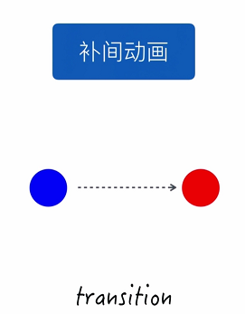
补间动画只需定义一个开始状态和结束状态,其余中间状态由浏览器自动填充,使用transition属性实现。
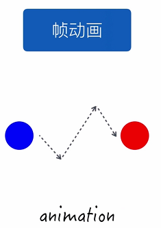
帧动画不只要定义开始和结束状态,还需要定义中间过程的帧,使用animation属性实现。
transition动画
transition动画只需定义动画的开始和结束状态,其余过渡状态由浏览器自动补全。示例代码如下:
HTML结构:
<div class="box">
    <div class="circle"></div>
</div>
CSS样式:
.box {
    width: 600px;
    height: 200px;
    border: 1px solid #ccc;
    background-color: #fff;
    margin: 200px auto;
}
.circle {
    width: 50px;
    height: 50px;
    /*定义开始状态小球的颜色和位置*/
    background-color: blue;
    border-radius: 50%;
    margin: 75px 0;
    /*注意transition有多个属性,此处为简写新形式,包括了两个属性*/
    /*即transition-property: all; transition-duration: 2s;*/

    /*transition-property设置过渡效果的CSS属性的名称*/
    /*transtion-property的值为all,表示background-color和transform都是过渡渐变属性,*/

    /*若此处transtion-property值为background-color,而transform不变,则只过渡渐变颜色,位置瞬移*/
    transition: all 2s;
}
/*定义结束状态小球的位置和颜色*/
.box:hover .circle {
    background-color: red;
    transform: translate(550px, 0);
}
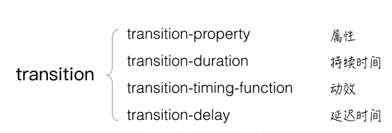
实例效果见codepen。transition共有如下四个属性。
另外transition-property不支持动画的一些属性如下:
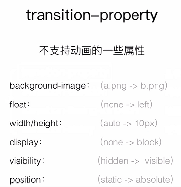
不支持将a图片过渡渐变为b图片;不支持float属性(即float属性从无到有);不支持将width/height属性从无渐变为某个值,但支持从一个长度渐变为另一个长度;不支持display属性从无到有;不支持visibility属性;不支持poisition属性。
animation动画
animation动画通过关键帧来定义动画的变化状态。示例代码如下:
HTML结构:
<div class="box">
    <div class="circle"></div>
</div>
CSS样式:
.circle {
    width: 50px;
    height: 50px;
    background-color: blue;
    border-radius: 50%;
    margin: 75px 0;
    /*animation: circleRun 2s ease infinite;*/
    /*animation也是一个简写属性,即上一句包括如下属性*/
    animation-name: circleRun;
    animation-duration: 2s;
    animation-timing-function: ease;
    animation-iteration-count: infinite;
    /*此外animation还有如下几个属性*/
    animation-delay: 2s;
    animation-direction: normal;
    animation-fill-mode: none;
    animation-play-state: running;
}
/*定义中间状态小球的关键帧*/
@keyframes circleRun {
    from {
        transform: translate(0, 75px);
    }
    33% {
        transform: translate(150px, 75px);
    }
    66% {
        transform: translate(400px, -75px);
    }
    to {
        transform: translate(550px, 0);
        background-color: red;
    }
}
实例效果见codepen。
使用animation实现页面正在loading的效果见codepen demo-animationLoading